
Mystery Forest
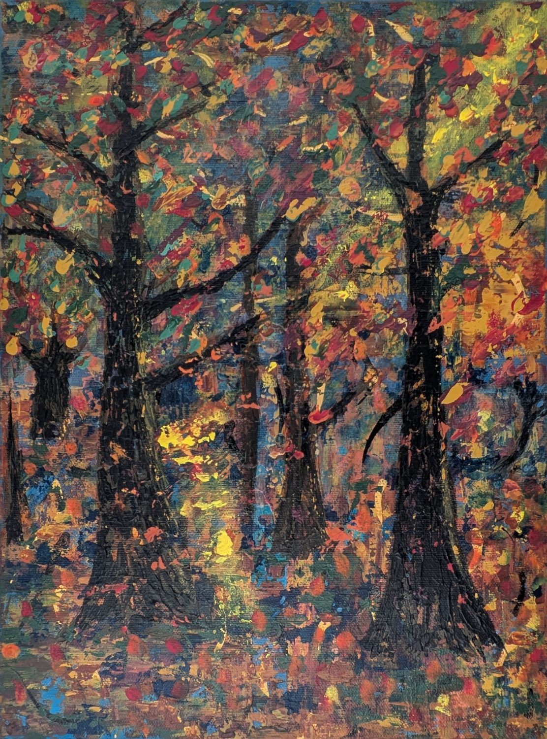 What began as a simple experiment with a quilt-like painting technique eventually became four
experiments on one canvas and an unexpected journey into an autumn forest.
5 November 2026
The Mystery Forest: Four Experiments, One Painting
What eventually became an autumn forest began as a series of experiments, each one building upon (or covering up!) the previous one. By the time I finished, I had explored four different approaches on a single canvas.
And somehow, they all led me into the woods.
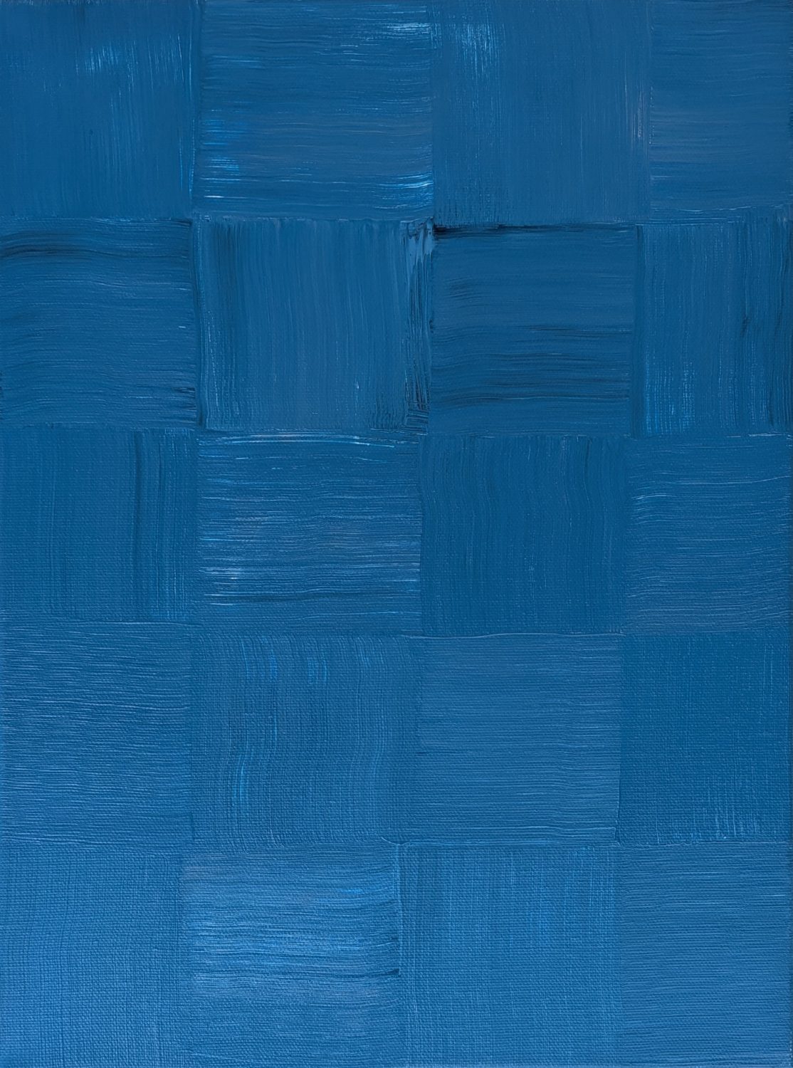
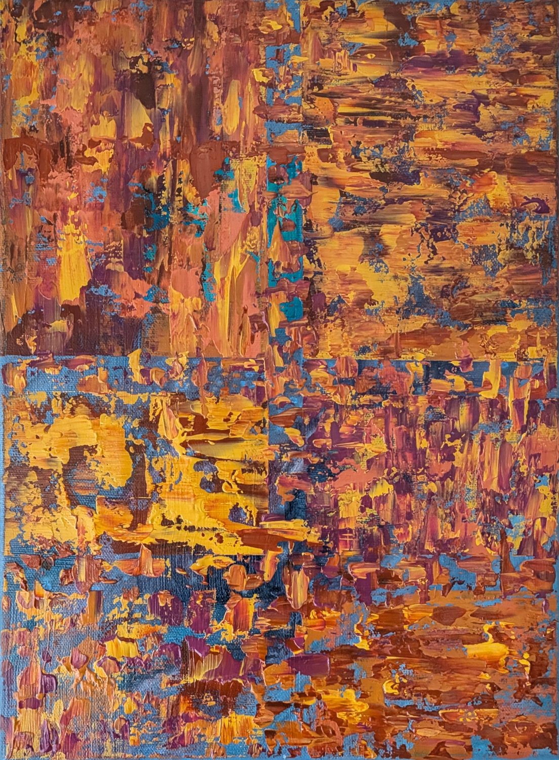
Experiment One: The Quilt
I had seen artist Vinod Kumar Varma on Facebook create a beautiful quilt-like painting using a technique called Charpai texture design. He created the woven effect by alternating the direction of his brushstrokes in each square.
I immediately wanted to try something similar. Of course, my attempt looked nothing like his, but I learned from the process and will definitely try it again with different colors and a better brush.
At this stage, there were certainly no trees in sight!
Experiment Two: Playing with Inks
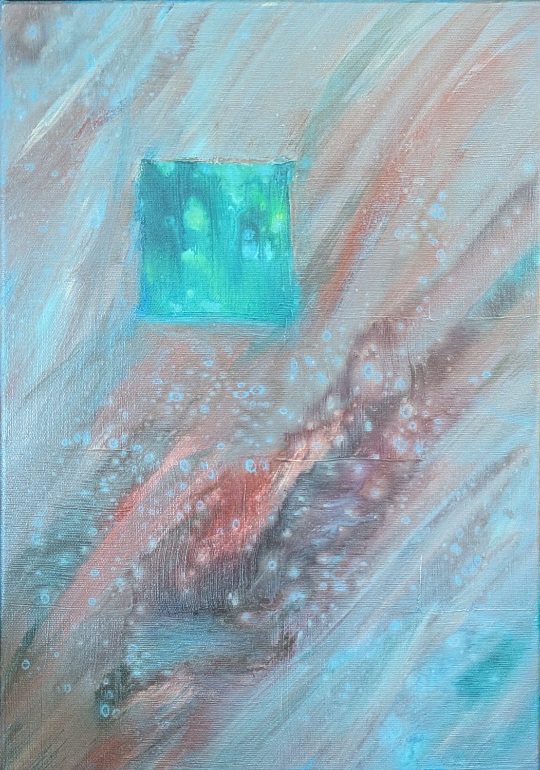
Next came the inks.
I wanted to explore how they would interact with the existing layers and the addition of isopropyl alcohol. I wanted to introduce a different kind of movement and unpredictability.
As with so many of my experiments, the results weren’t necessarily what I expected. Some areas became more interesting, while others left me wondering what to do next.
But that’s one of the things I enjoy about experimenting. Even when something doesn’t work as intended, it often creates opportunities I wouldn’t have discovered otherwise.
Experiment Three: Brown Patches and Texture
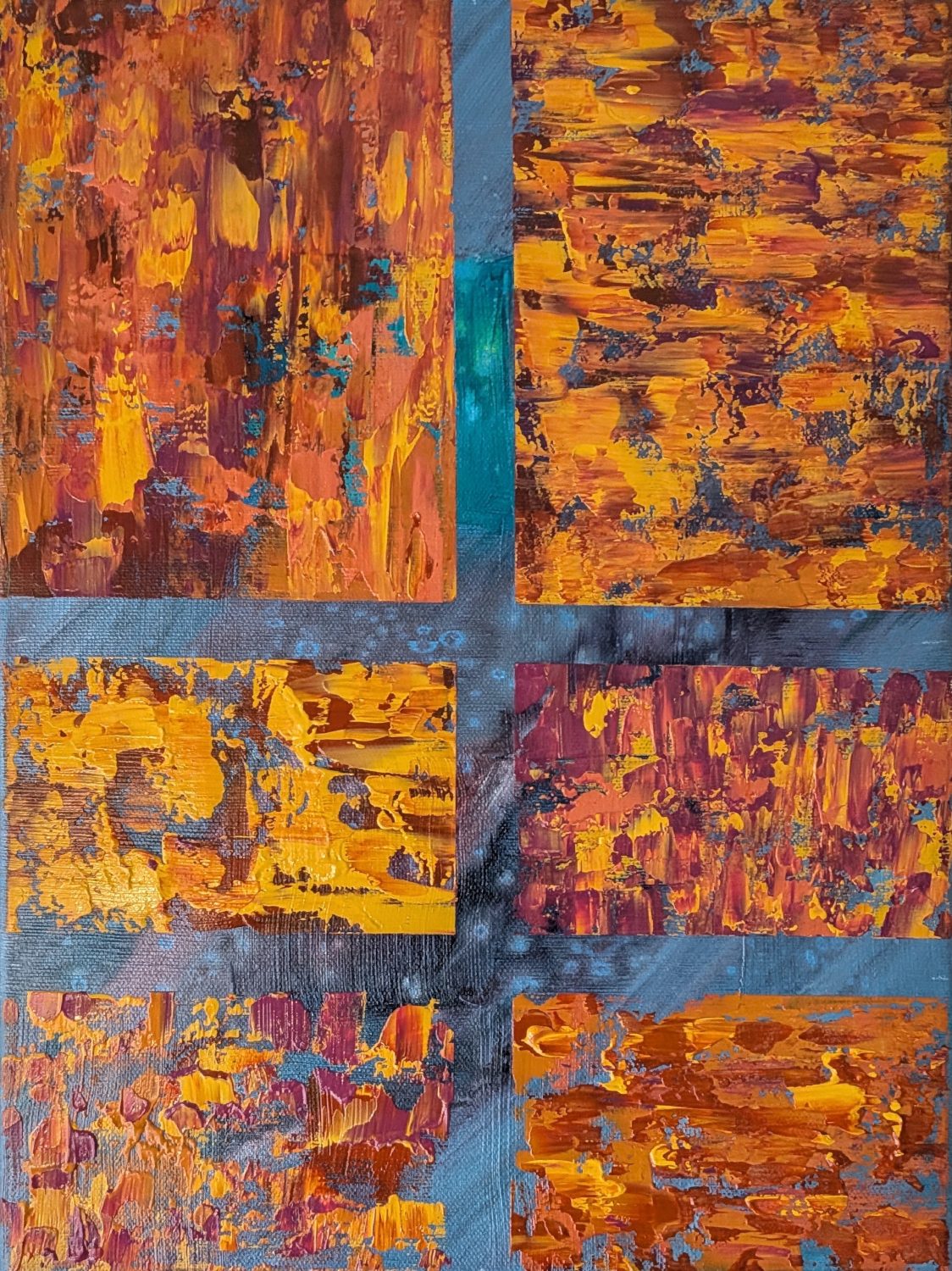
For my third experiment, I introduced masking tape to explore texture in a more controlled way, experimenting with different shades of brown and various ways of applying the paint.
By this point, the canvas had accumulated quite a history. Colors, patterns, inks, and textured areas were all competing for attention.
I liked parts of it, but I knew its journey wasn’t complete. So I did what I often do when I’m unsure where to take a piece next.
I hung it on the wall and lived with it for a while.
Sometimes the best thing I can do is stop painting and simply look.
Experiment Four: Into the Forest
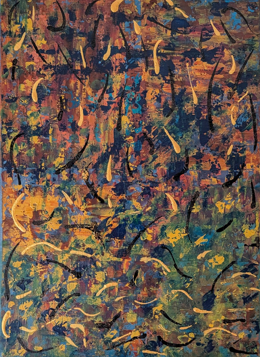
At first, I just knew something needed to change. I added wisps of gold and black, followed by some green. It looked a little weird, but those unexpected marks eventually helped me imagine something entirely different: trees.
The existing colors reminded me of autumn, and I wondered whether I could transform the abstract background into a forest.
This was a little intimidating because painting recognizable subjects is still outside my comfort zone. I’m much more comfortable working with colors, textures, and abstract shapes than trying to make something look like an actual tree.
But I was intrigued enough to try.
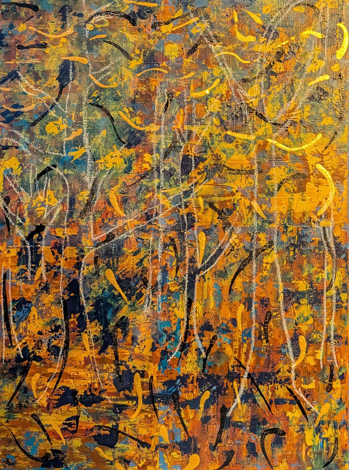
I began by sketching tree outlines directly onto the canvas with chalk. I wanted to see whether the composition would work before committing to paint.
My vision was to create the feeling of standing inside a forest, surrounded by trees, wondering which path to take next.
Depth and perspective were my biggest challenges. I wanted the larger trees in the foreground and smaller trees farther away to create the illusion of looking into the woods.
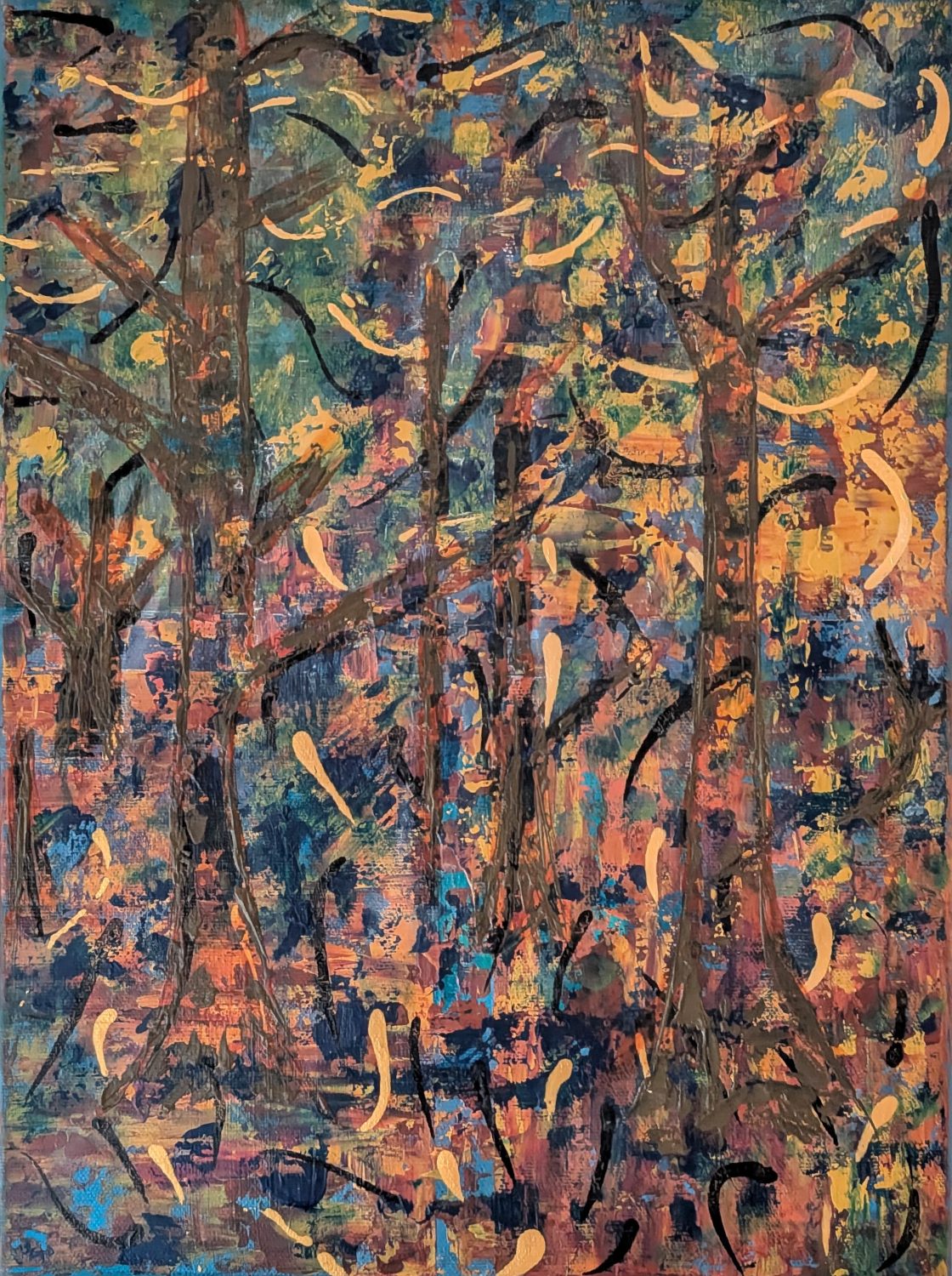
Once I was satisfied with the rough layout, I outlined the trees with a burnt umber glaze. Then I used a mixture of brown and Payne’s Grey with a palette knife to build up the trunks and branches.
And suddenly, there was a forest!
Well, sort of. 🤣
When Autumn Looked a Little Too Much Like Fire
The next challenge was foliage.
I started adding orange, red, and yellow leaves, hoping to create a beautiful autumn scene.
Instead, I found myself staring at something that looked a little too much like a kindergarten art project. 🤣
The leaves felt disconnected from the rest of the painting, and the bright colors were overwhelming.
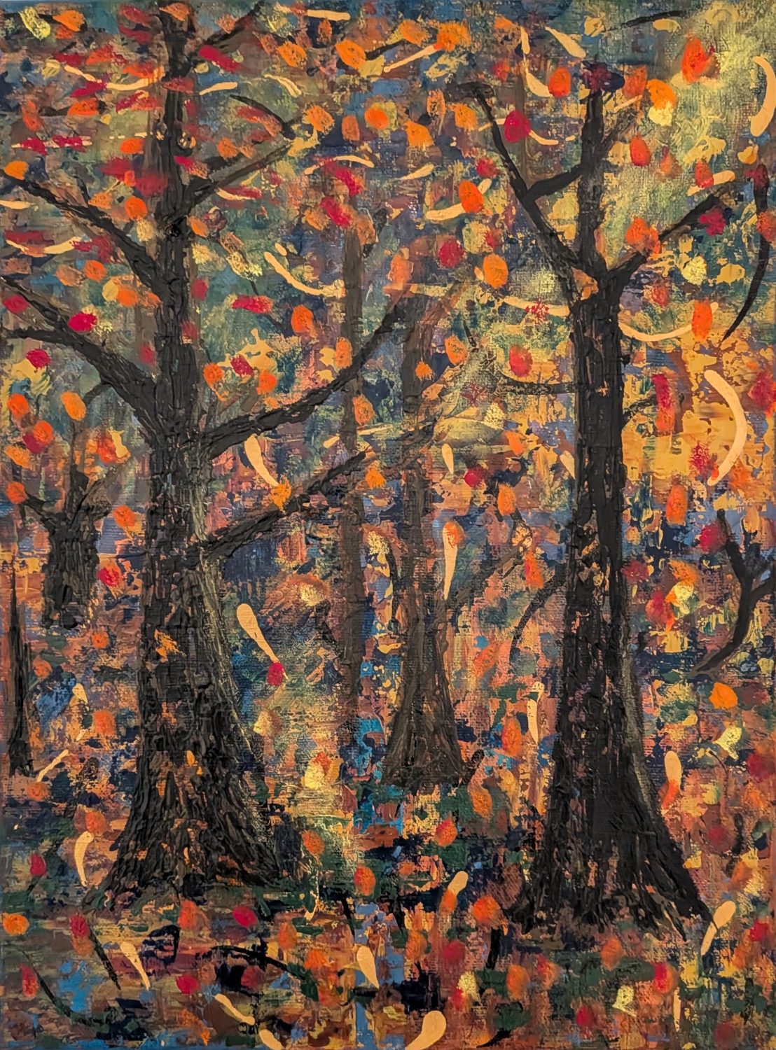
I considered several options, including removing them entirely.
But rather than giving up, I reached for my palette knife.
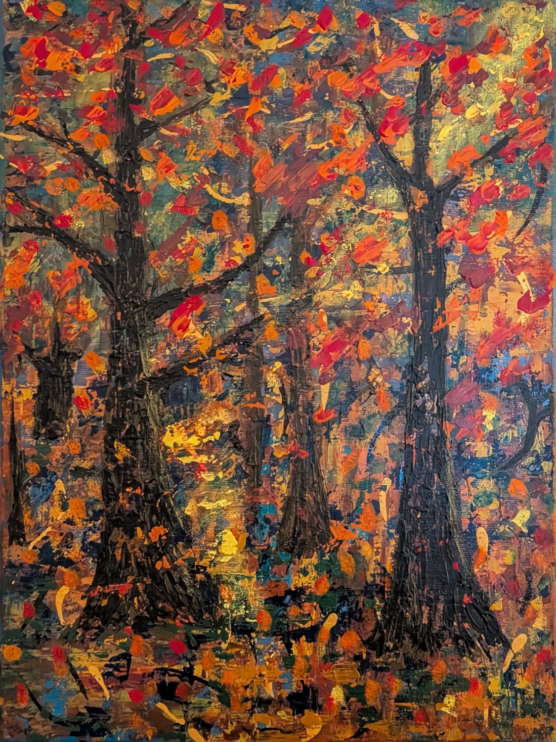
I began dragging and blending the colors, breaking up the individual leaf shapes and allowing them to become more abstract.
Almost immediately, the painting started feeling more like me.
The foliage became less literal, the colors began interacting with one another, and the trees felt more integrated into the original background.
It was a good reminder that I don’t necessarily have to abandon my abstract approach to explore recognizable subjects.
Finding the Light
One of my favorite parts of the painting was something I hadn’t originally planned. As the forest began taking shape, an area of yellow between the trees started looking like sunlight illuminating a path deeper into the woods.
When I stepped back and viewed the painting from across the room, that little glowing area immediately caught my attention.
It became the focal point I hadn’t realized the painting needed and I strengthened it a bit more.
I continued making adjustments, adding greens and ochre to balance the reds and oranges, removing some distracting marks from the original experiments, and introducing subtle highlights to the tree trunks.
I also used a transparent green-gray glaze in selected areas to soften the background and create a little more depth.
Slowly, the painting began to feel more cohesive.
The forest was still colorful and abstract, but now it had atmosphere, depth, and a sense of mystery.
The Mystery Forest
As I was nearing completion, my son looked at the painting and suggested a title.
The Mystery Forest.
I loved it immediately.
The name captured exactly what I had been trying to create: a forest that invites you to wander in, explore, and wonder what might be waiting beyond the trees.
And I love that the glowing path leaves that question unanswered.
Looking back, this painting was quite a journey.
It began as a quilt experiment, evolved through inks and textures, and eventually became my first attempt at painting an autumn forest.
There were several moments when I questioned what I was doing, and more than a few when I wondered whether I had ruined it.
But I kept experimenting.
And perhaps that’s my biggest takeaway from this piece.
Sometimes the most interesting destination is one you never planned to visit.
The Mystery Forest, named by my son. ❤️
Mystery Forest 40 × 30 cm